
Latest news
Blog & insights
Oct 30, 2025
Lee Webster
How we redesigned our website to better showcase the art (and drive more sales)
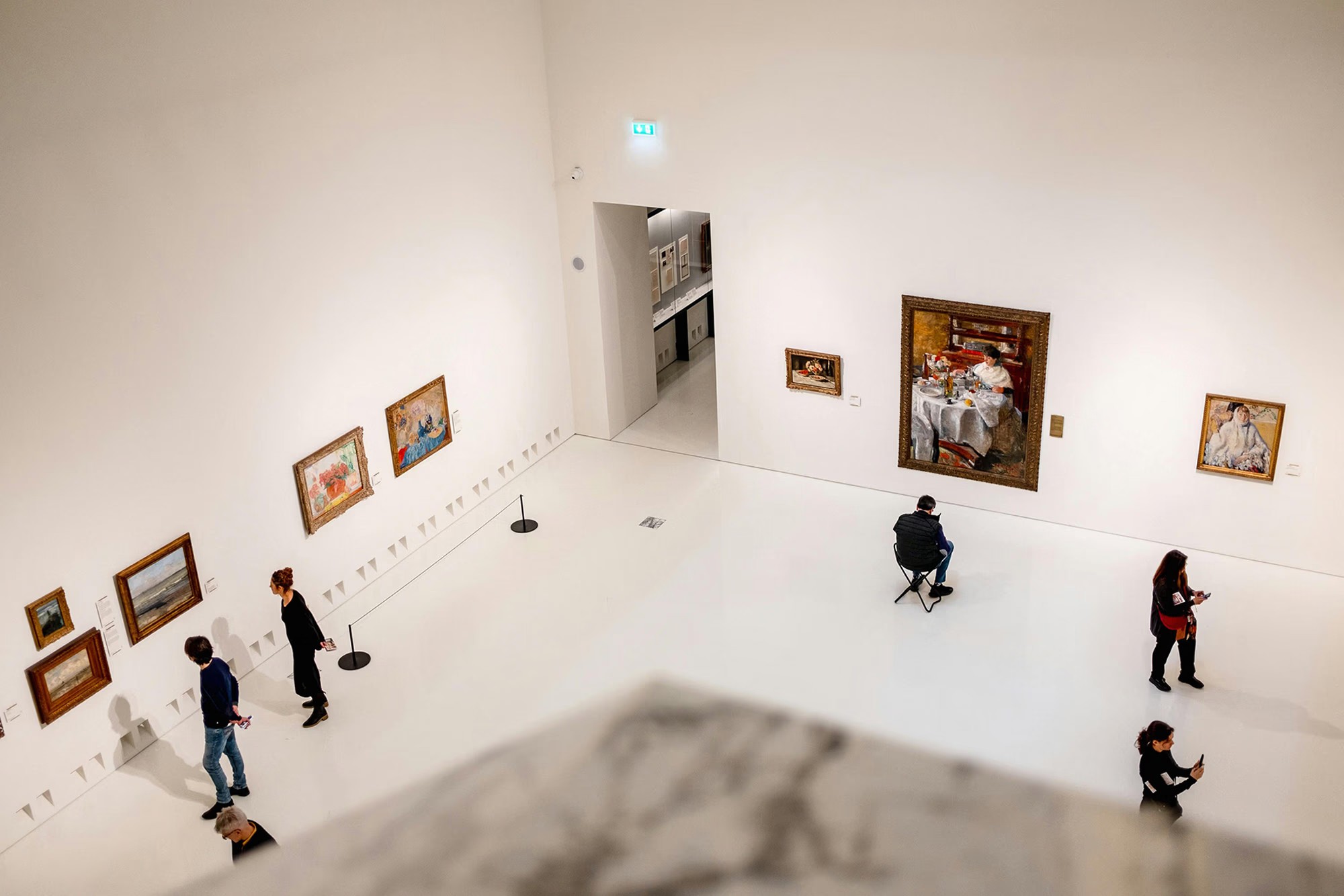
For us, the gallery has always been about the experience.
Seeing artwork in person. Taking your time. Discovering pieces that actually resonate.
But when it came to our website, that experience wasn’t translating.
It looked fine, but it didn’t quite capture the feeling of being in the space, and more importantly, it wasn’t making it easy for people to explore or buy.
Why we decided to rebuild the website
Like a lot of galleries, we initially treated the website as more of a digital catalogue.
A place to list artwork, share updates, and give people a sense of what we do.
But over time, it became clear that it needed to do more than that.
We wanted a website that would:
Properly showcase the artists we work with
Make browsing feel natural and engaging
And support online sales, not just in-gallery visits
Our existing site wasn’t doing that.
Navigation felt clunky, the layout didn’t guide people anywhere in particular, and there wasn’t a clear journey from discovery to purchase.
Working with Greenlights
We ended up working with a web development company based in Poole.
What stood out straight away was their focus on how people actually use websites, rather than just how things look.
Instead of jumping straight into design, they looked at:
How visitors browse artwork online
What information they need before making a purchase
And where people typically drop off
That shift in thinking made a big difference, especially in how the site now supports enquiries and sales.
If you’re looking for something similar, you can see more about their approach to building conversion-focused websites.
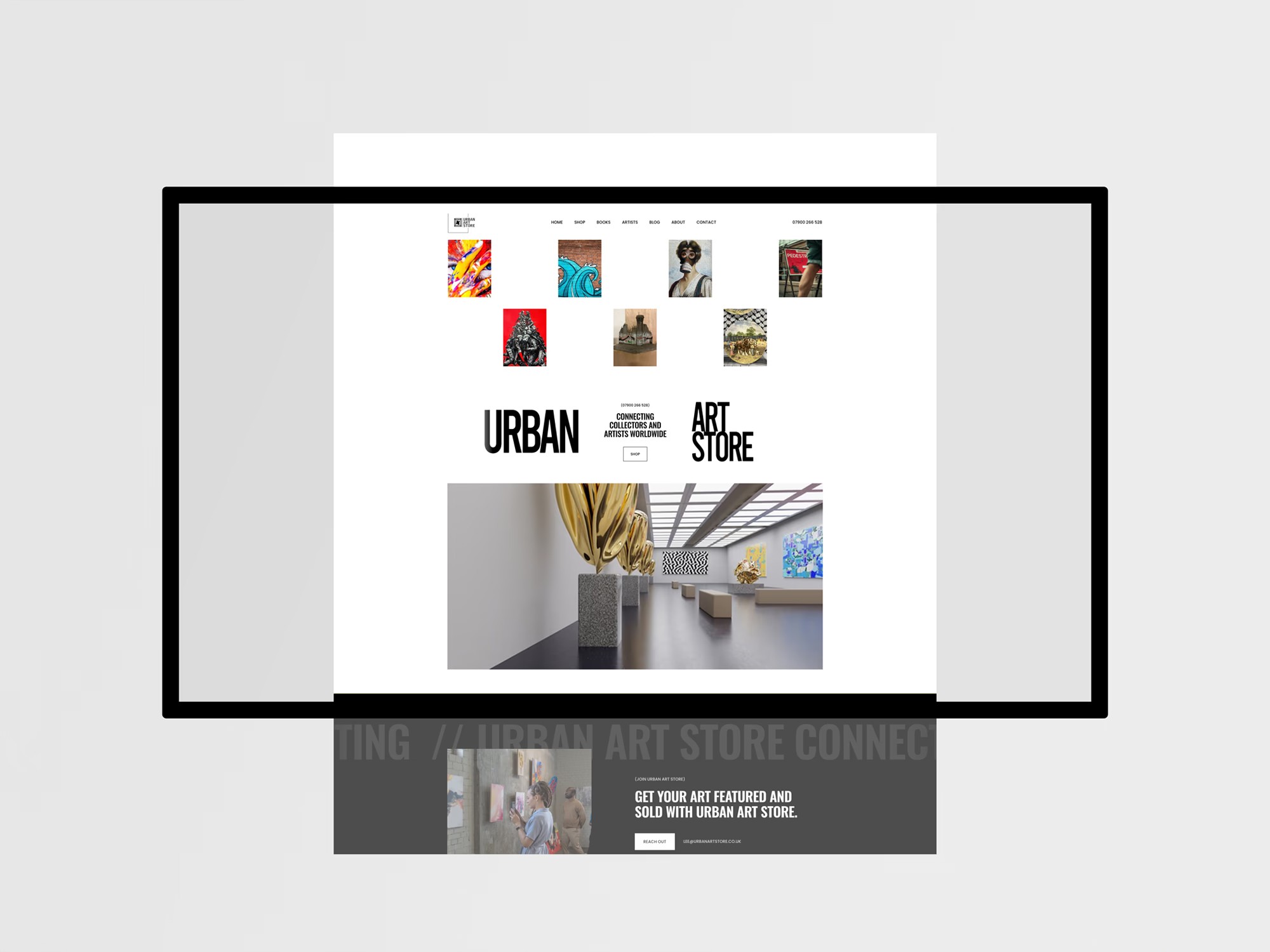
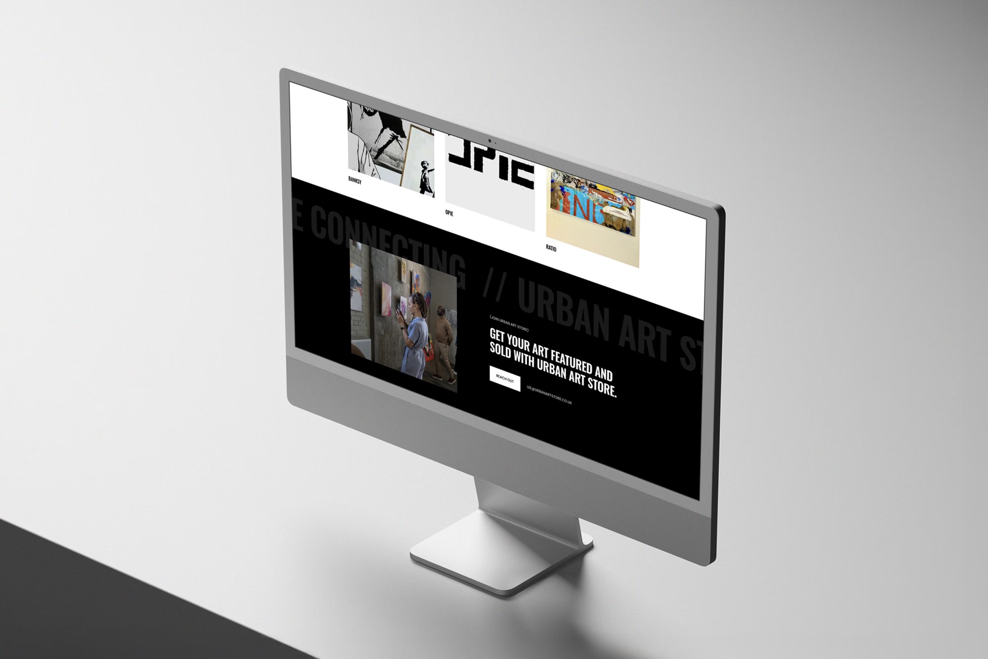
What changed on the new website
The biggest change wasn’t just visual, it was structural.
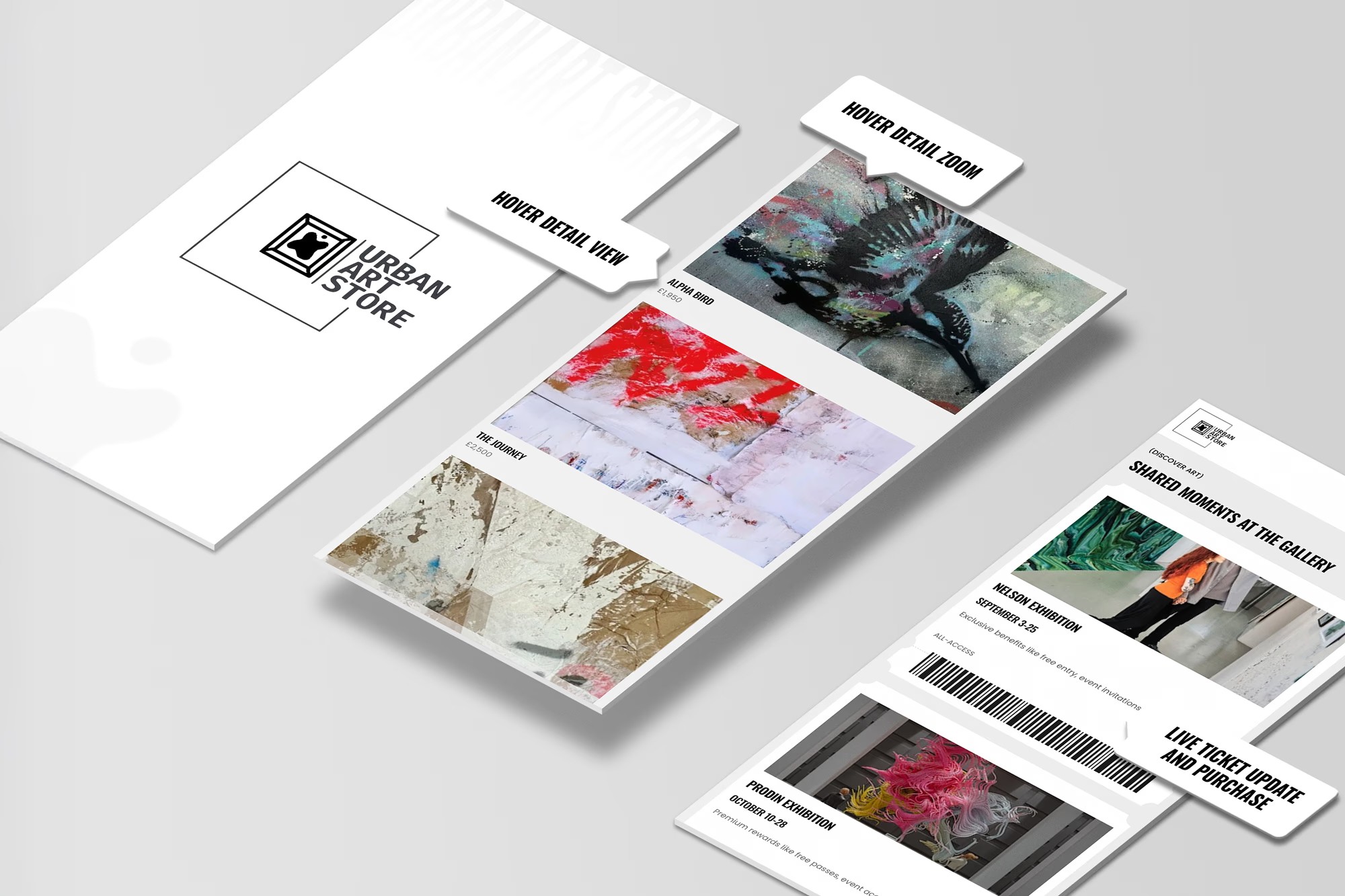
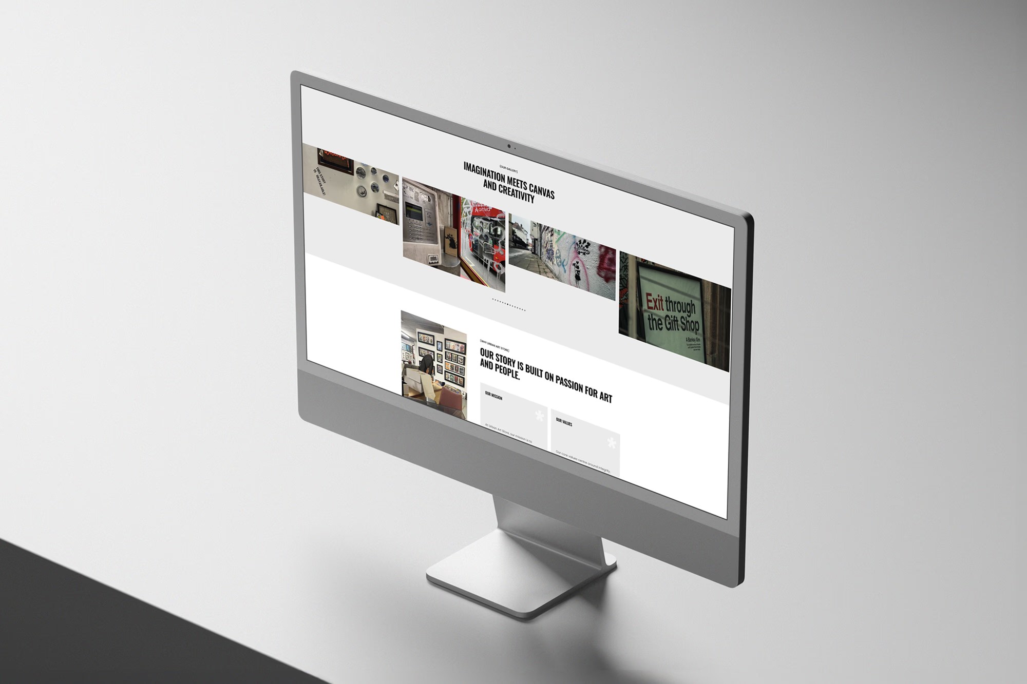
A clearer browsing experience
Artwork is now easier to explore, with a layout that encourages people to move through collections without friction.
Better presentation of each piece
Each artwork now has space to breathe, with clearer information and a more considered layout that reflects its value.
A more intentional journey
Instead of leaving visitors to figure things out, the site now guides them naturally, from discovery through to enquiry or purchase.
The impact so far
Since launching the new website, the difference has been noticeable, something that’s also covered in more detail in the full project breakdown.
We’re seeing:
More engagement across the site
More time spent browsing artwork
And an increase in online enquiries and sales
People arrive with a clearer understanding of what we offer, which makes a real difference.
You can view our live shop here.
Final thoughts
A gallery website isn’t just about showing artwork.
It’s about creating an experience that feels considered, intentional, and easy to navigate.
Working with a web development company from Poole that understands that made a big difference for us.
If your website isn’t supporting your business in the way it should, it’s probably not just a design issue, it’s a structure issue.
For us, making that shift has been well worth it.
We redesigned our gallery website to better showcase our artists and drive online sales.